Visual Marketing
Data: 27/11/11 · Professional
 Sigues el primer en comentar
Tweet
More than 4 years ago the usability guru Jackob Nielsen wrote a post in his blog under the title:How Little Do Users Read? In that post Nielsen said “On the average Web page, users have time to read at most 28% of the words during an average visit; 20% is more likely.”
Although there is a old question regarding the impact of new technologies and the reading habits, it seems the online users need to have not only the old reading habits, but also new reading skills, as this old article from New York Times shows.
Nielsend discovered the users typically follow what he called the F-Shaped Pattern. This dominant reading pattern looks somewhat like an F and has the following three components:
•Users first read in a horizontal movement, usually across the upper part of the content area. This initial element forms the F’s top bar.
•Next, users move down the page a bit and then read across in a second horizontal movement that typically covers a shorter area than the previous movement. This additional element forms the F’s lower bar.
•Finally, users scan the content’s left side in a vertical movement. Sometimes this is a fairly slow and systematic scan that appears as a solid stripe on an eyetracking heatmap. Other times users move faster, creating a spottier heatmap. This last element forms the F’s stem.
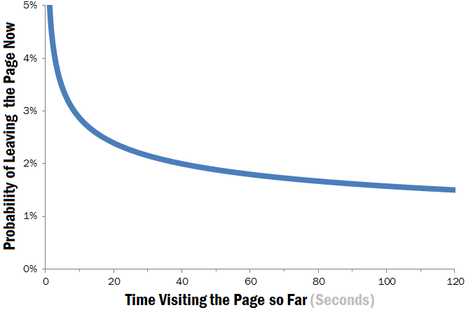
Following this reading pattern, we should include how long do users stay on web pages. According recent post from Jackob Nielsen users often leave Web pages in 10–20 seconds. According to a recent research from Microsoft the first 10 seconds of the page visit are critical for users’ decision to stay or leave.
The probability of leaving is very high during these first few seconds because users are extremely skeptical, having suffered countless poorly designed Web pages in the past. People know that most Web pages are useless, and they behave accordingly to avoid wasting more time than absolutely necessary on bad pages.
It is clear online users behaviour is very different from online. Your content is under consideration in less than 10 seconds!
To work with that, I suggest to be as much as visual and interactive you can using all type of formats for the storytelling, from video to infographics.
Let’s see some visual engaging and viral formats that help to retain users with us:
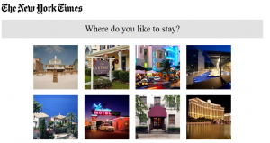
An interactive and visual quiz from New York Times.
Interactive Magnum game.
3. Ted Sphere
TED Sphere Visualization
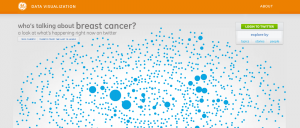
Real time buzz visualization.
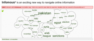
5. Infomous
Viual News from the Buzz
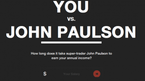
6. John Paulson Interactive Infographic
John Paulson interactive infographic, an example of content marketing using interactive infographic format.
The above are some examples of formats you can use in your website to improve user retention, engagement and improve your viral marketing. Let’s work Visual Marketing: The Art to Retain Users Using Visual Formats.




No hi ha comentaris